Energy Drink
Branding
My work and perspective in energy drinks — where the can is the whole brand: billboard, package and social prop in one 12-ounce cylinder.
In this category
JSTWRK Energy
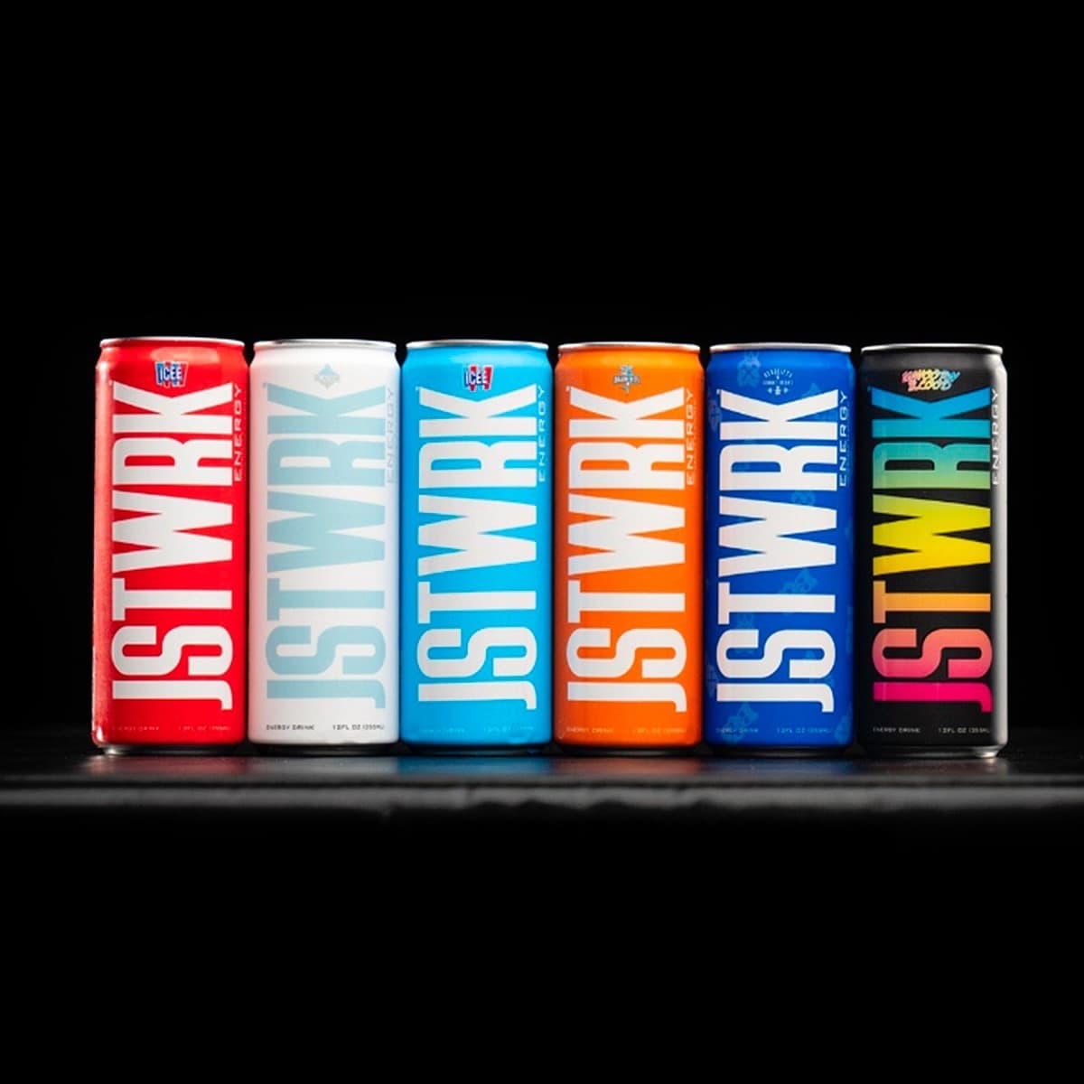
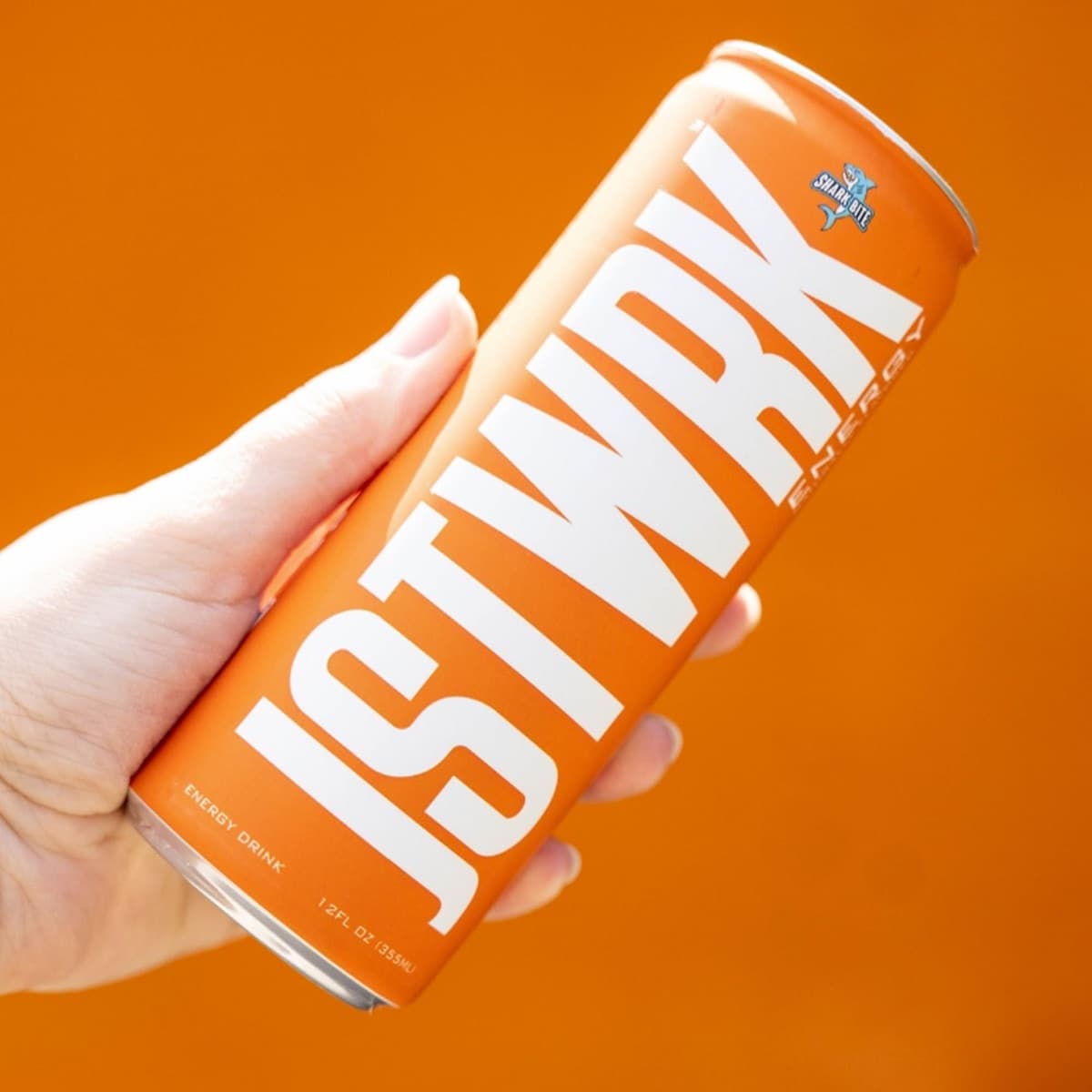
A flavor-forward energy brand created across naming expression, logo, packaging, and product visualization.
Case study OngoingBUM Energy
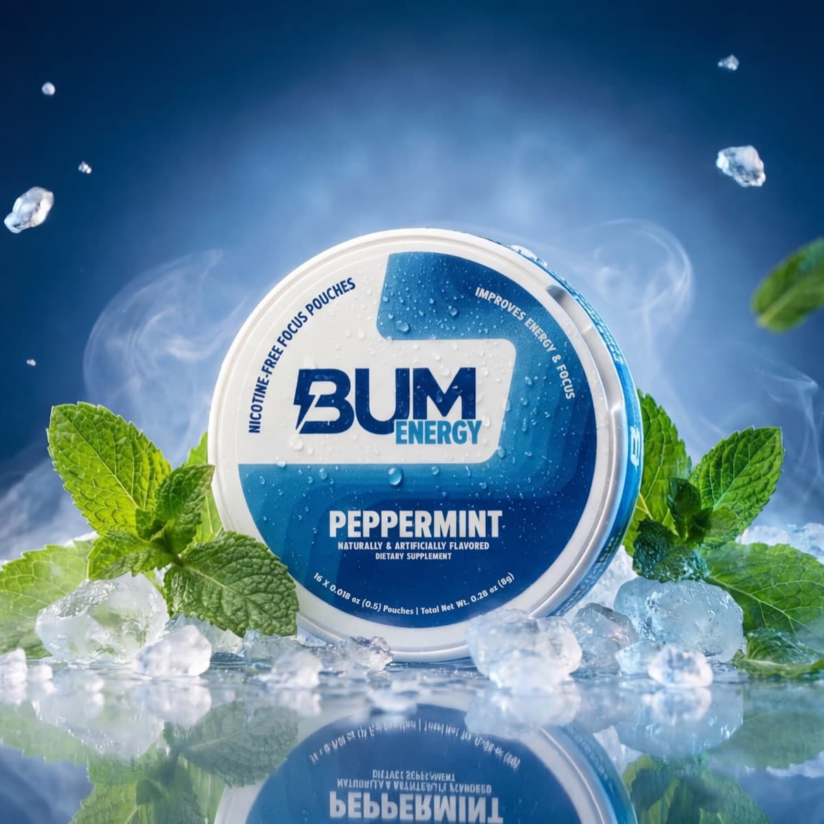
A high-energy creative partnership spanning digital campaigns, retail graphics, product content, rendering, and pouch label design.
Case study Selected work'Merica Energy
Selected work for 'Merica Energy across Rebranding.
Case study Selected work3D Energy
Selected work for 3D Energy across Mockup Renderings and Product Visualization.
Case studyHow this category speaks
A can is the most honest format in CPG: no box, no insert, no second chance. The logo has to work vertically, the flavor has to read from the fridge door, and the whole thing has to look right in a hand on camera — because that's where it will live most of its life.
For JSTWRK I built the system flavor-first: six SKUs sharing one typographic spine, each owning a full-bleed color. Line them up and they read as a collection people want to complete — that collectible instinct is half the marketing.
Energy is also the most social-native category I work in. Every design decision gets tested against a phone screen: does the can survive compression, cropping, and a busy feed? If it needs the whole shelf context to make sense, it fails.
Retail notes
Cooler doors punish complexity — condensation, glass glare and tight facings kill small type. Big flavor color and one dominant word win the fridge.
Limited flavors and collabs drive repeat attention to the same shelf spot; the base system has to absorb new SKUs without redesign.
Looking for an agency team for a energy drink branding project? That's Gerart Media ↗