Hydration
& Aminos
My work and perspective in hydration and amino packaging — the daily-use side of sports nutrition, where refreshment cues replace aggression and the design has to feel drinkable.
In this category
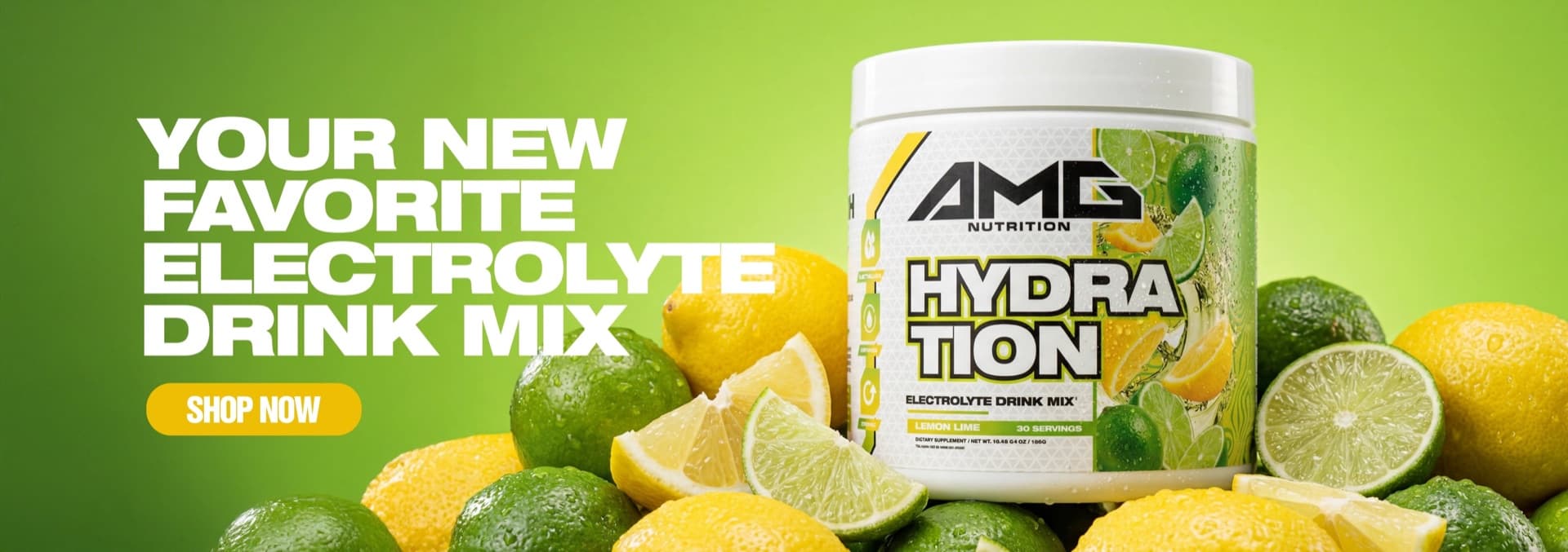
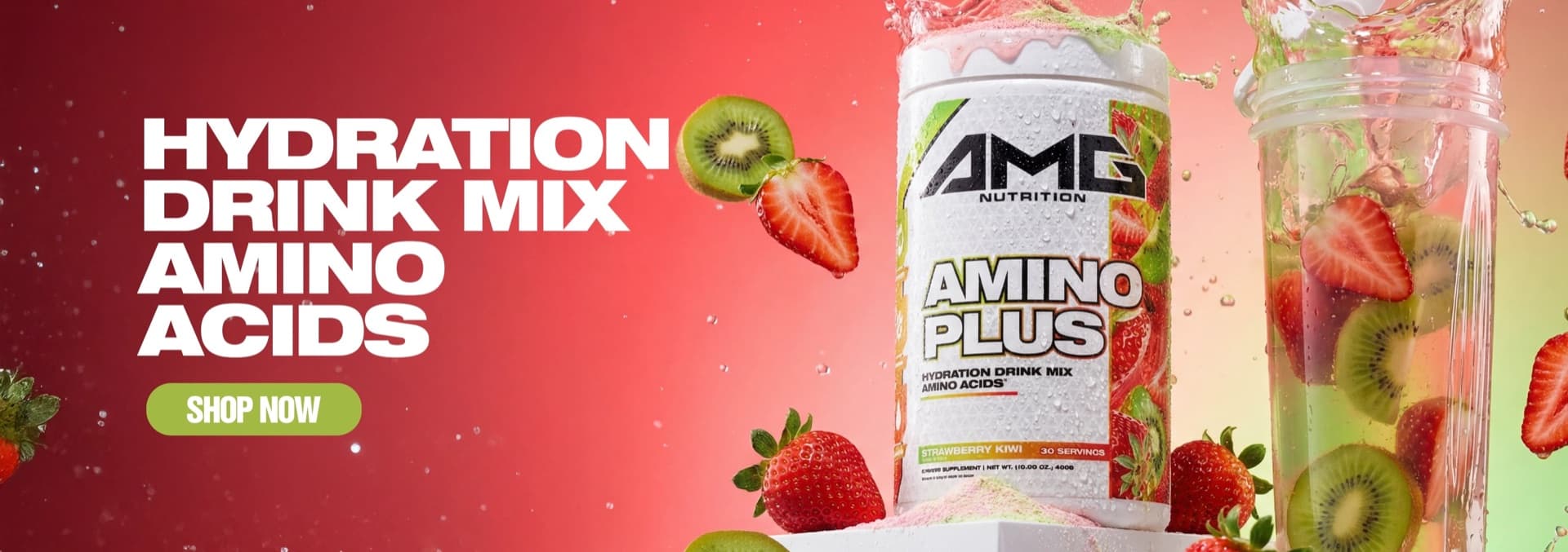
AMG Nutrition
A complete brand expression spanning identity, packaging, photography, product content, social, and website creative.
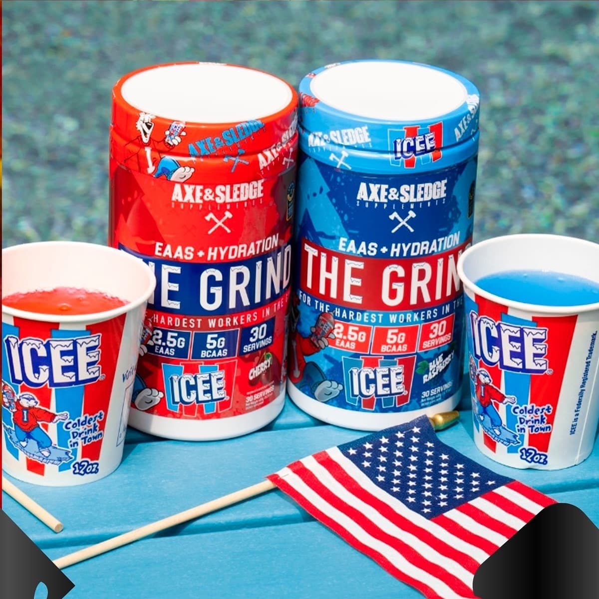
Case study Selected workAxe & Sledge
Helping move the brand toward a more visual, colorful packaging language across flavors, collaborations, and protein bars.
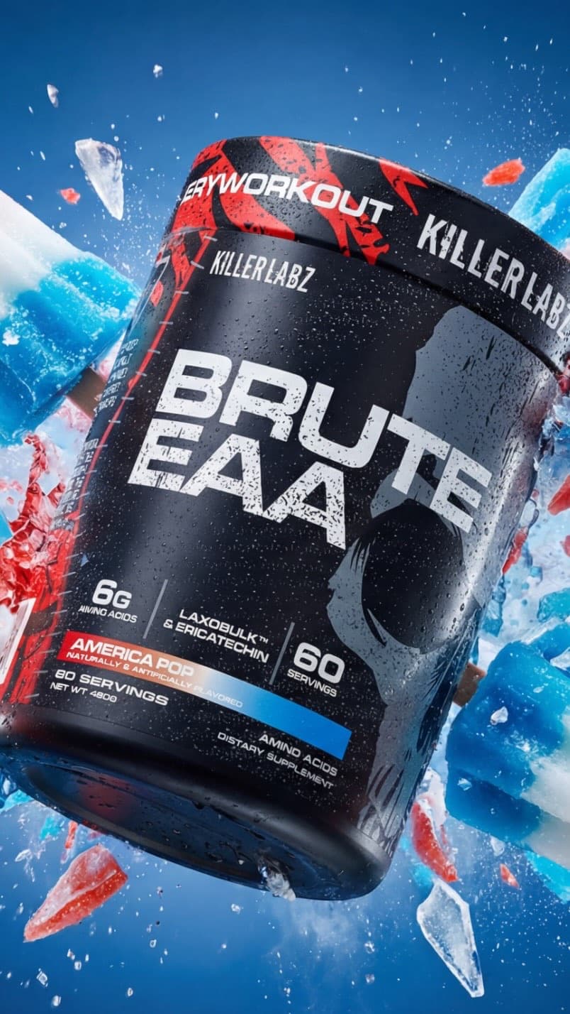
Case study 2019–2020 · 2022Killer Labz
Selected work for Killer Labz across 2019–2020 Rebranding, 2022 Rebranding and Packaging Design.
Case studyHow this category speaks
Hydration sells a sensation, not a stimulant. Water, ice, condensation and real fruit do the persuading — my AMG Hydration and Amino Plus work is built on macro fruit photography and splash textures that make the powder feel like the finished drink.
The palette logic flips versus pre-workout: lighter fields, more white, color used to signal flavor freshness instead of intensity. It's the corner of the store allowed to feel like a beverage aisle, and the design should take that permission.
Daily-use products live on the kitchen counter, not in a gym bag. A tub that looks good in a morning-routine photo earns its repurchase; that lifestyle test drives my layout and finish decisions in this category.
Retail notes
Hydration shelves are where sports nutrition meets mainstream shoppers — packaging that reads 'supplement-aggressive' loses the crossover buyer.
EAA/hydration hybrids like The Grind carry two stories on one panel; the flavor collab (ICEE) leads and the formula supports, never the reverse.
Looking for an agency team for a hydration & amino packaging project? That's Gerart Media ↗