Protein Powder
Branding
My work and perspective in protein packaging — the category where trust and appetite appeal matter more than volume, and the label works closer to food than to supplement.
In this category
MuscleForce
Selected work for MuscleForce across Rebranding.
Case study Selected workAxe & Sledge
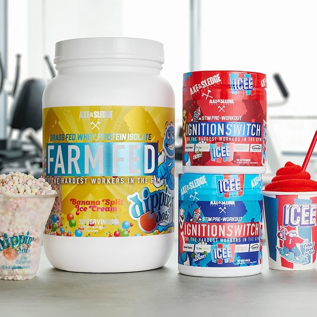
Helping move the brand toward a more visual, colorful packaging language across flavors, collaborations, and protein bars.
Case study OngoingRAW Nutrition
Daily multidisciplinary creative support connecting B2B, digital, retail, packaging, content, and product imagery across the RAW Nutrition ecosystem.
Case study Selected workNutraBio
Selected work for NutraBio across Label Design, Product Photography, B2B Assets, Social Media Graphics and Website Graphics.
Case studyHow this category speaks
Protein buyers behave like food buyers. The label that wins isn't the loudest — it's the one that looks like it tastes good and tells the truth. I design protein closer to premium food packaging: cleaner grids, real flavor cues, macros treated as a design element instead of a footnote.
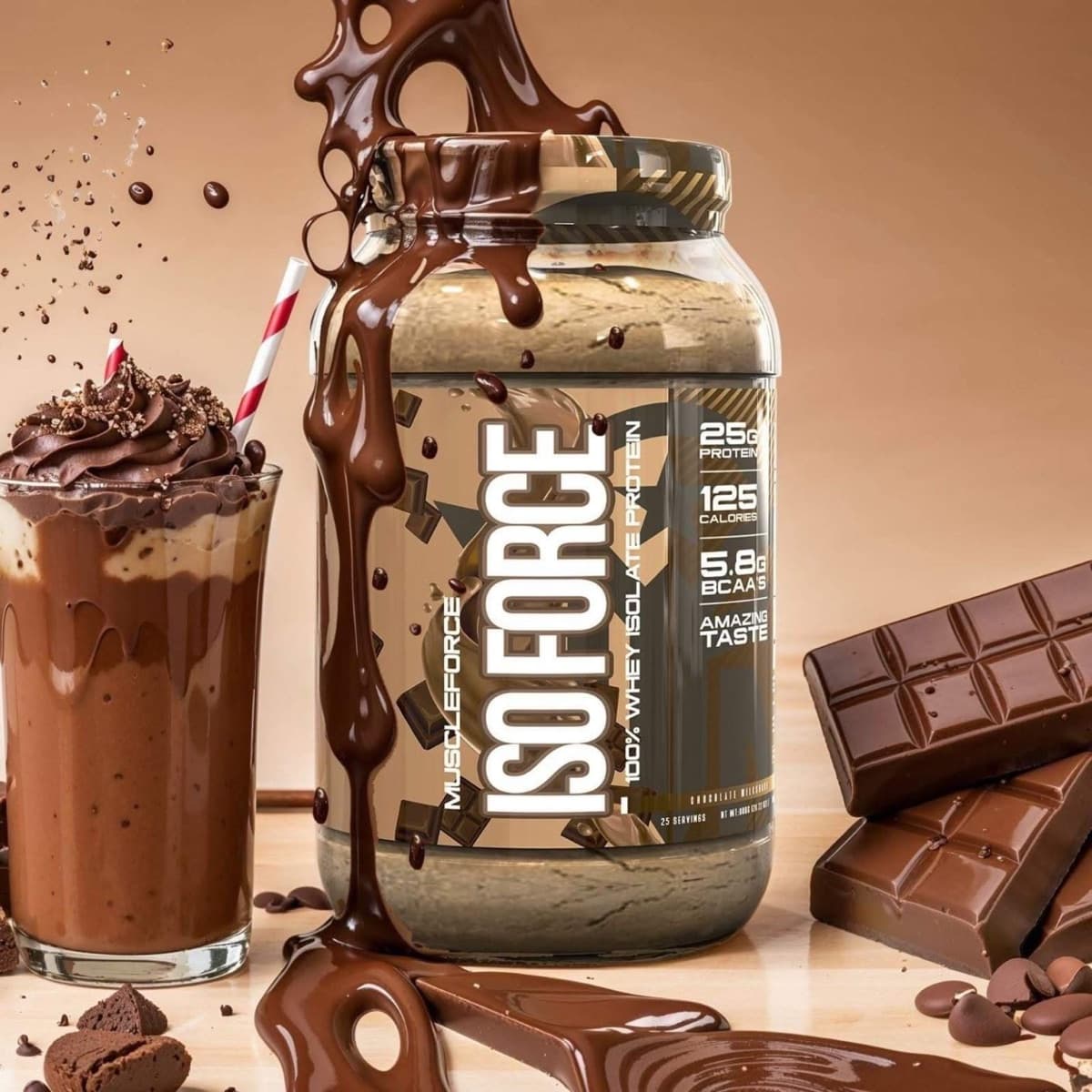
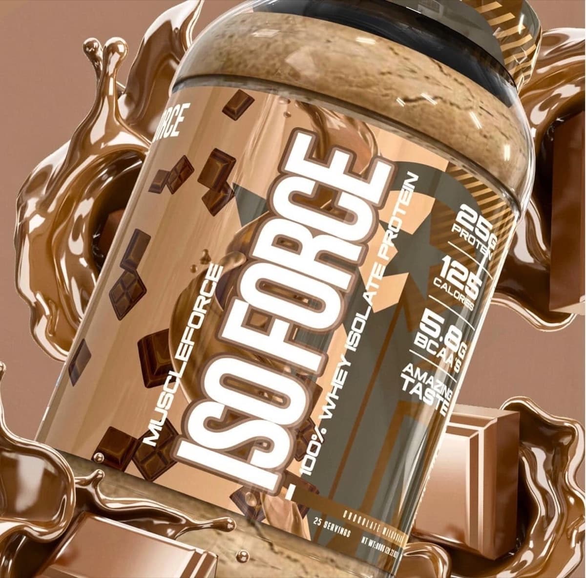
Appetite appeal is craft, not decoration. On ISOFORCE the chocolate isn't a stock swirl — the pour, the bar, the milkshake are staged so the tub sits inside a dessert scene and borrows its craving. That's the difference between naming a flavor and selling one.
Trust shows up in typography. Generous spacing, disciplined claim hierarchy and consistent flavor architecture across the line tell the shopper this brand runs a tight operation — which is exactly what they're about to ingest.
Retail notes
Protein tubs are big and shelved low as often as at eye level — strong shoulder and lid branding rescues visibility on bottom shelves.
Flavor color has to survive next to competitors using near-identical chocolate/vanilla codes; the differentiation load falls on the brand block and the scene, not the swatch.
Looking for an agency team for a protein powder branding project? That's Gerart Media ↗