Pre-Workout
Packaging
My work and perspective in pre-workout packaging — the loudest, most contested shelf in sports nutrition, where a label has about one second to win.
In this category
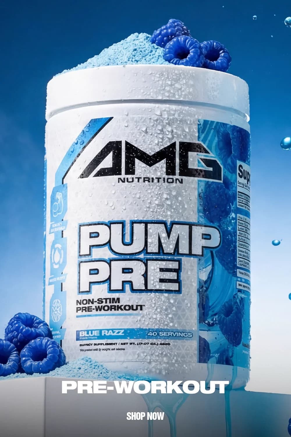
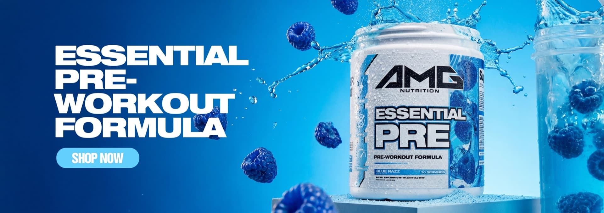
AMG Nutrition
A complete brand expression spanning identity, packaging, photography, product content, social, and website creative.
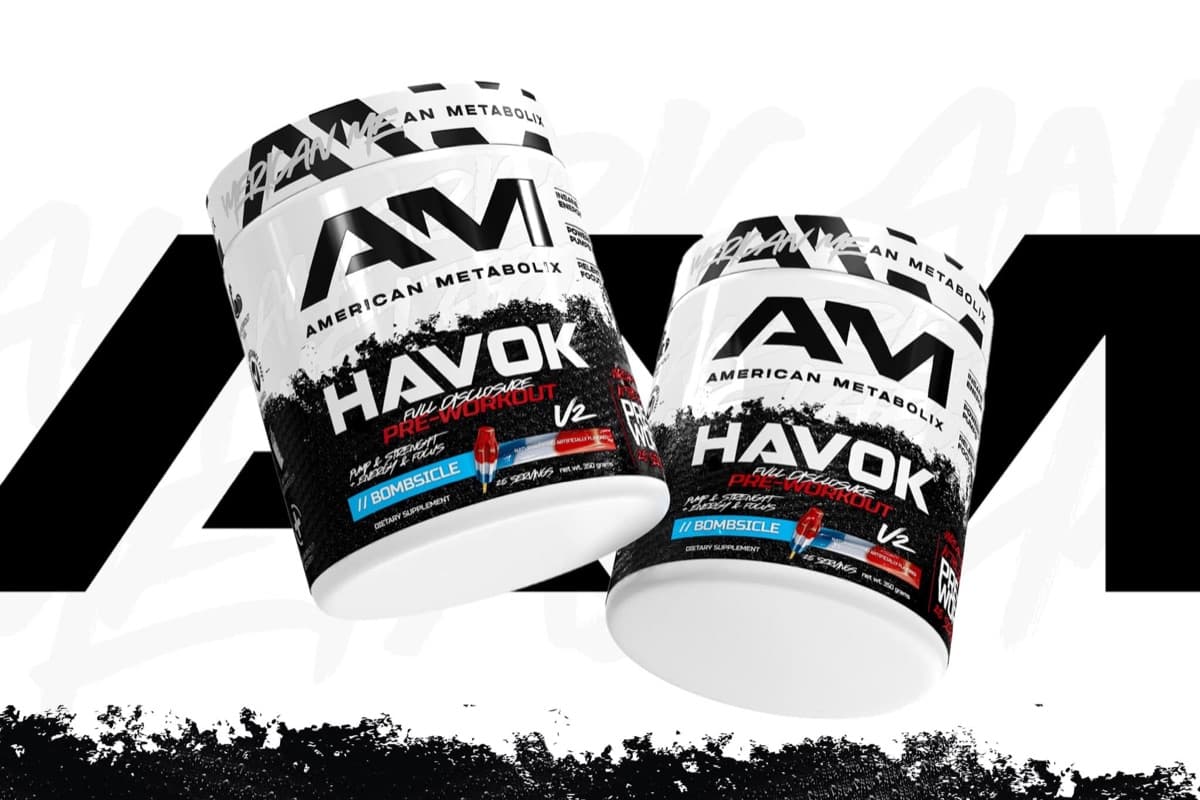
Case study Selected workAmerican Metabolix
A connected system of branding, packaging, photography, and product rendering built for a performance-focused nutrition brand.
Case study Selected workAxe & Sledge
Helping move the brand toward a more visual, colorful packaging language across flavors, collaborations, and protein bars.
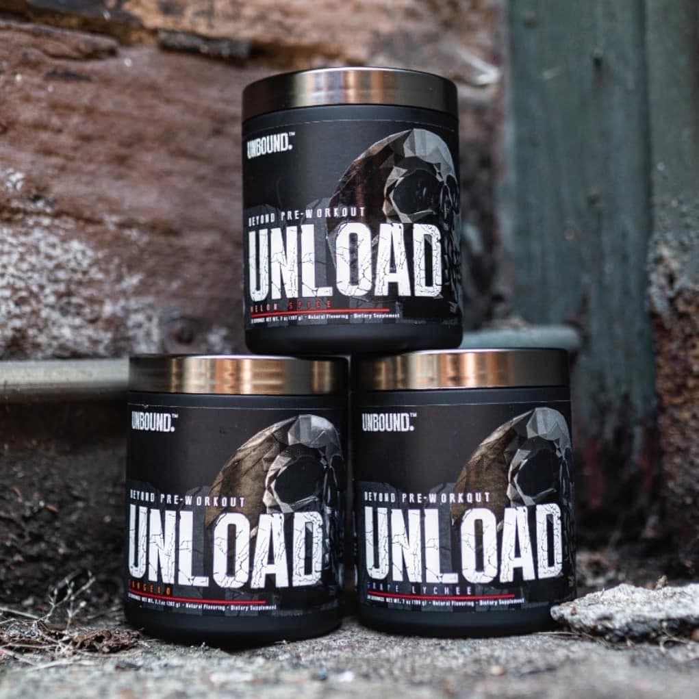
Case study Selected workUnbound
Logo and packaging design created to establish a clear, modern identity for Unbound.
Case studyHow this category speaks
Pre-workout is the category where restraint loses. The buyer is promising themselves a better session, so the design has to deliver energy before the powder does: high contrast, condensed black type, flavor color used at full saturation instead of as an accent.
The discipline is in the hierarchy. Stim level, pump claims, servings and flavor all fight for the front panel — my job is to decide the one thing a label says at three meters, the two things it says in the hand, and push everything else to the back panel where it belongs.
A pre-workout is never one SKU. I design the flavor system first — how the color field, the flavor lockup and the accent graphics rotate across the line — so the brand reads as a wall, not as a single tub lost in the noise.
Retail notes
On a GNC or Vitamin Shoppe shelf the category sits dark — black tubs dominate. A saturated color field or a white base breaks the wall faster than any claim.
Tubs are read top-down in store: the lid and shoulder carry more visibility than most brands use. Collabs like the Axe & Sledge × ICEE line show how far a recognizable license can carry a flavor story.
Looking for an agency team for a pre-workout packaging project? That's Gerart Media ↗